ZIU
Check your exam results anywhere!
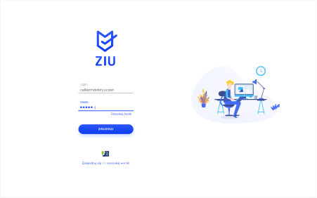
ZIU is a web application designed for the Ministry of National Education of Poland. It allows elementary and high school students to easily check their exam results on their phones and computers.
ZIU was designed to be simple to use, minimalist and delightful to look at. It’s powered by innovative solutions allowing it to function flawlessly even under high load. We’ve also made sure that it strictly adheres to the rigorous WCAG 2.0 guidelines.
Logo
The symbol is a combination of elements hinting at the application’s main functionality – checking exam results. The shield symbolizes safety and security, the check symbol refers to the process of filling in answer sheets, while the open notebook points to the connection to books and knowledge.
Shield
safety security
reliability
trust
checkmark
exams
checking
correct answer
notebook
(openness)
learning knowledge
books
Colors
We wanted our color palette to be light and delicate while retaining enough contrast to ensure that the content is always clear and easy to read for all kinds of users.
Typography
We needed a font that conveys fun and friendliness but is also very simple, coherent and easy to ready. We’ve found Nunito to be the perfect font for the job. It goes hand in hand with our illustrations and it also works great in spreadsheets and long paragraphs of text.
Icons
We’ve designed a set of minimalist icons that work well with the font. Their job is to clearly highlight some of the key elements of the app that the user can interact with.
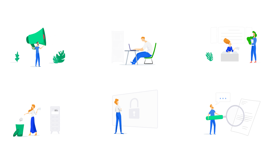
Illustrations
Our talented illustrators have created a bespoke set of images to complement the information displayed on the screen. The images are very light and minimalist, so not to steal the user’s attention from what’s important.
Challenge
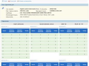
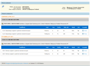
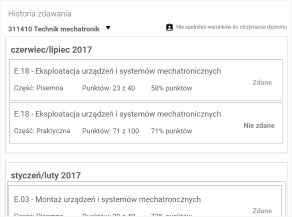
Until now every local examination committee used its system for keeping a record of the examinees and the exam results.
Our task was to combine the functionalities of all the systems used across the entire country and create a single platform that would not only store information but also make it accessible to the students.
Ideation
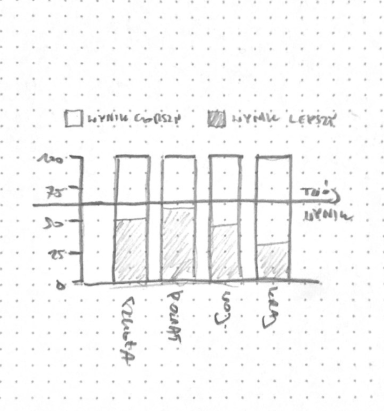
Early analyses and meetings with the local examination committees have made it possible for us to create some wireframes.
They’ve allowed us to better understand the systems that we’re dealing with, categorize and structure the information in such a way that makes them legible despite their high volume.
Less is more
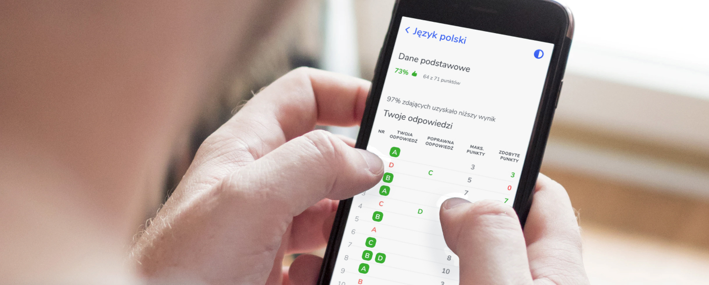
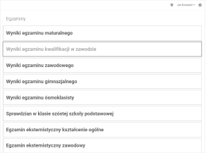
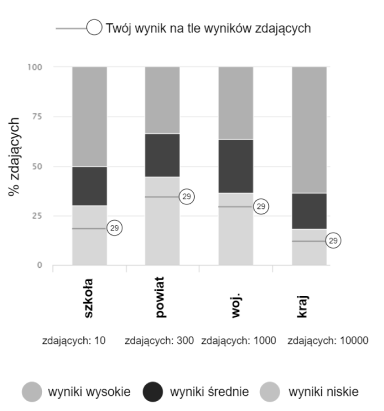
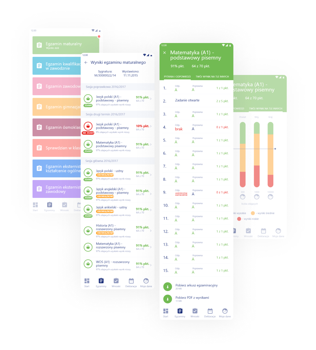
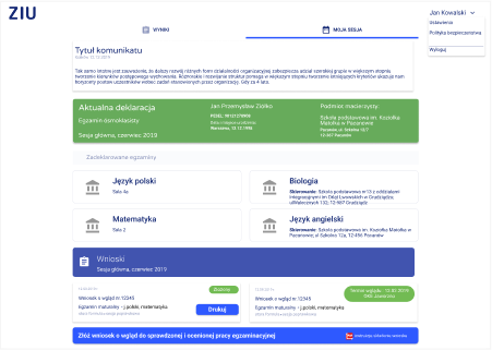
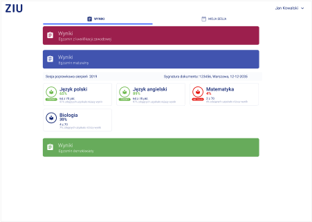
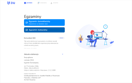
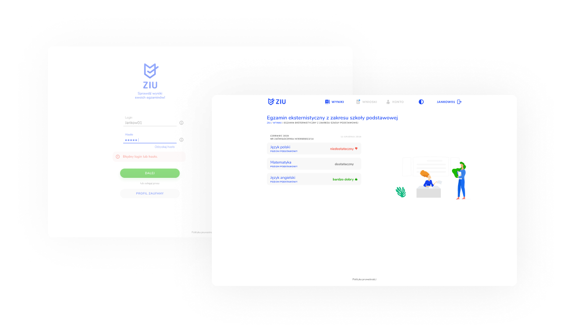
We aimed to reduce the amount of information displayed on the screen and highlight the key elements most important to the user.
We’ve also wanted to find a way to inform the user how their exam results in comparison with the rest of the students. This, in turn, would allow them to find out whether their score was high enough to apply to their school or university of choice.
Access points
The publication of exam results puts the servers under a very high load. Knowing the bandwidth and server capacity limitations we had to figure out a way to make the app a little less resource hungry in times of increased load.
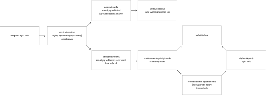
Our idea was to redirect the user to a simplified version of the app that connected to a database that would only deliver the very recent exam results in times of increased demand.
We’ve made sure that the user would always receive the same kind of experience regardless of whether the servers were undergoing any kind of stress.
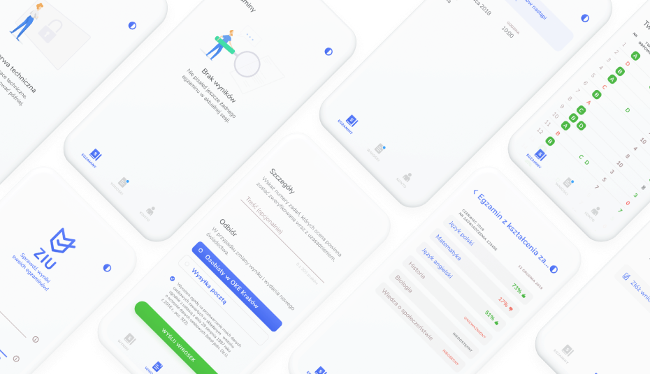
Interface Design
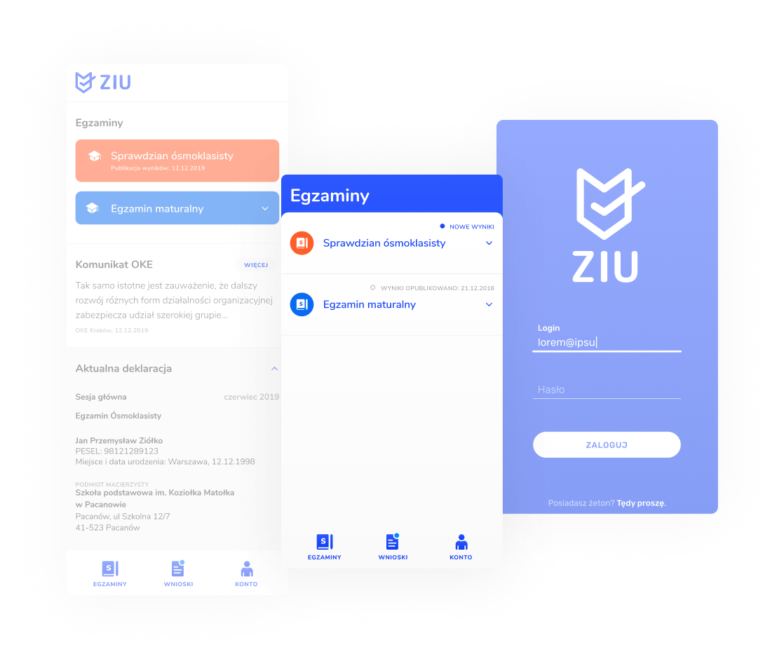
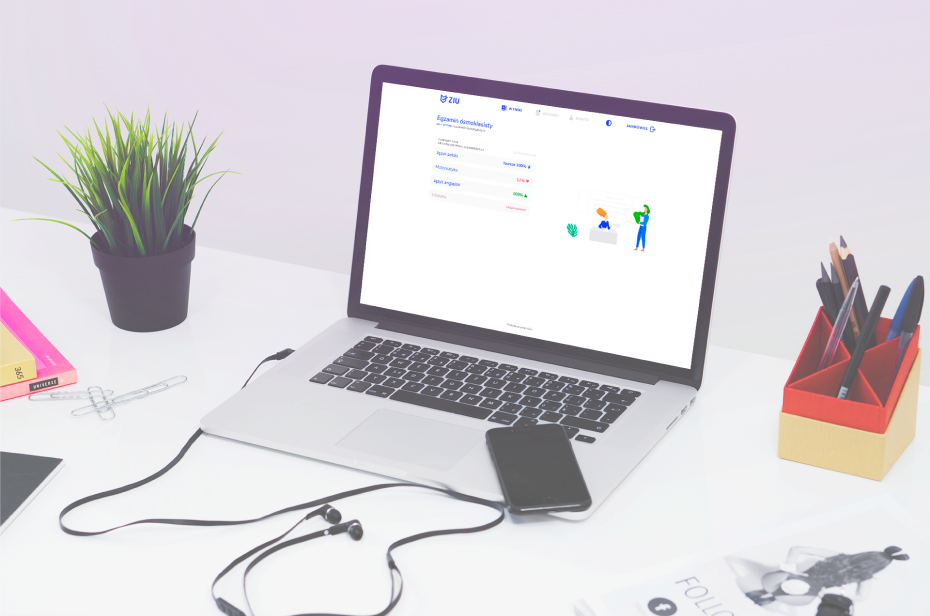
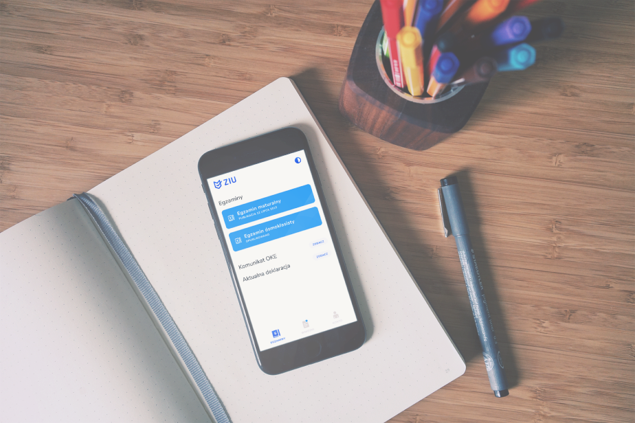
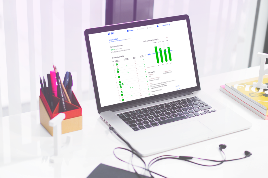
As with all our projects, we’ve worked on delivering the same kind of experience on all kinds of devices.
We’ve worked hard to present complex spreadsheets on a tiny, mobile device screen. We kept on reducing the amount of unnecessary information with every iteration.
Collaboration
The lines of communication between us and the other parties engaged in this project, ITSS and OKE Kraków, were open at all times. This ensured that we could discuss and control the project at each stage.
We’re extremely grateful for the fact that we’ve been granted a great deal of trust, which allowed us to focus on delivering the best possible solutions.
Many thanks again to OKE Kraków and ITSS.
Reduction
We wanted to differentiate the different types of exams through colors. When put to user tests, our color palette turned out to be less than ideal due to its low contrast. The number of different colors also introduced a kind of information overload that we wanted to avoid in this app.
Moreover, the WCAG guidelines forced us to modify our color palette in such a way that it made them quite unpleasant and simply boring. All this led us to the realization that the best way to handle colors in ZIU is to reduce their number.
What’s most important is that thanks to extensive user testing and working with our partners, we’ve managed to shave off all of the information clutter. We’ve simplified the interface and used techniques such as progressive exposure to always point the user in the right direction and hand them the info that they need.
Final touches
We’ve user-tested the first version of the app with a reduced number of colors. We’ve also enriched the projects by introducing illustrations.
Final version
The final version of the app features an even more ascetic color palette. Despite sufficient legibility and accessibility of the standard version, we’ve decided to implement a high-contrast mode for vision-impaired users.
We’ve also introduced improved, less detailed, and less distracting illustrations.
ZIU was designed to be accessible on all kinds of devices through the use of RWD and AWD techniques.
CONTACT
CONTACT
Let's talk about your next project
We see that you are using Internet Explorer, which is no longer officially supported. To ensure the best possible viewing experience of our website, we recommend to use the latest versions of the following browsers: